ExpertUp
Role: UX/UI Designer, Researcher
Duration: 8 months
Software: Axure RP, InVision, UsabilityHub
Purpose
Expertup aims to bridge the gap between the user's knowledge and their expertise. This means that whatever question the user can't find an answer for, they can go to Expertup and ask the community of experts. View prototype
Overview
This case study focuses on my process of taking ExpertUp from an idea to a flushed out functioning prototype. I chose to take on ExpertUp because it would emphasize the importance of structure and organization in creating an information heavy app that the user will be able to smoothly operate and navigate through. It would feature a wide array of information in different categories.
Feel free to scroll on through! I tried to make my study as short as possible but it still ended up pretty lengthy.
The design thinking process was central to ExpertUp's development.
Empathize
Understanding the User
In order to create a platform that people are interested in using, I needed to understand who the people who would use ExpertUp are and what they need from the app.
This is the basis for User Centered Design, which is based around the user's needs, not the creator's, and what I kept in mind throughout the rest of the process.
At this stage, I made research plans, wrote detailed documents, and wrote and conducted user interviews, surveys and discovered patterns with affinity mapping.
I outlined functional and business requirements in two documents, wrote a research plan, script and summary after the research was finished.
The requirements gave me an idea of what problems the app would be solving.
View the functional requirements here and business requirements here.
I started out with describing my goals for this round of research. This was written down as a Research Plan document detailing the goals and the methodologies.
Research Goals
1. Identify the user's drive for seeking advice on a subject
2. Identify the user's needs and goals when seeking advice on a subject
3. Identify pain points encountered with current methods of seeking advice
2. Identify the user's needs and goals when seeking advice on a subject
3. Identify pain points encountered with current methods of seeking advice
Surveys - Quantitative Research
What: The quantitave research method I used was surveys, which were conducted via google forms. Google would automatically compile the metrics of each question asked.
Why: Conducting the surveys was a way for me to get basic data around the potential user needs and motivations when dealing with this product.
How-Thought Process: When coming up with questions to ask on the survey, I thought about finding the user’s motivations and attitudes behind certain behaviors.
For instance, since ExpertUp would be an app to help users get advice about a topic from someone knowledgeable, I asked about their current habits around finding information they don’t know.
Two of the questions were:
2. Where do you go when you need to find information about your interests or something else?
3. Why do you use that service? What do you like or dislike about it?
3. Why do you use that service? What do you like or dislike about it?
The reasoning behind asking this question was to see what platforms people were currently using, and gain insight on what about those platforms made them keep using them. This would show me what attributes to have in ExpertUp.
See the full survey/interview script here.
Findings: Unsurprisingly, search engines came up a lot. This caused me to ask another question:
4. Do your resources ever fail to provide you the information you were looking for? What happened?
This let me know where and how ExpertUp could fill a gap in the market. Turns out, search engines, as I knew in my own experience, could fail from time to time. Many users said that when that happened they would rephrase the question. And sometimes that worked. Sometimes it did not.
This was a valuable point in the research that informed me of ExpertUp’s potential to solve a problem that many people were having by using just search engines.
See the full summary here.
I also made sure to phrase the questions as clearly as possible, to lessen any misinterpretations that having a gray area could result in. For me this is even more important when doing surveys because respondents can’t ask you what you mean like they can in-person or in video calls.
How-Logistical: I gathered participants, by asking friends and family, and also by reaching out through social media networks such as Slack and Facebook. I tried to use Instagram also, albeit unsuccessfully.
Around 20 participants completed the surveys in total.
Takeaways: I learned that the nature of Instagram would impede getting a response in a timely manner, and users of that platform would likely expect more of an incentive in order to take time out and do a survey for you, because sponsorships are common there whereas they are not on Reddit for example.
Interviews - Qualitative Research
After the surveys had given me more of a picture of who the user base would be and what could motivate them to seek an app such as ExpertUp, I went ahead and conducted interviews with similar questions. I decided to use the same script to see what insights came up during an interactive session. Conducting interviews is an important stage because it can unlock patterns that wouldn’t have been otherwise seen following a rigid survey format where participants can only choose from the answers provided.
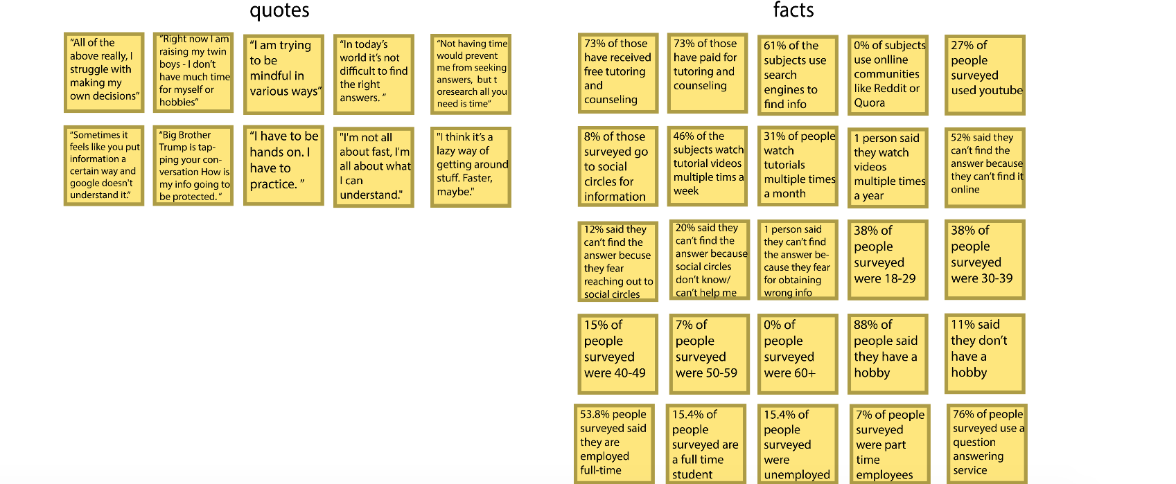
The statements that the participants made during the surveys and interviews were then compiled into an affinity map. I sorted similar ideas and notes into groups. This allowed me to more easily spot patterns in what they were experiencing.

Major Insights:
• People felt that search engines are incredibly reliable, although they do fail them from time to time.
• When search engines do fail, they rephrase the question and/or go to another search engine.
• People seek advice for things that they have no experience in. If it's an interest or hobby that they are familiar with, they see no need to look for help with it.
• When search engines do fail, they rephrase the question and/or go to another search engine.
• People seek advice for things that they have no experience in. If it's an interest or hobby that they are familiar with, they see no need to look for help with it.
Findings: The findings from this round of research showed me that including the video feature would help differentiate the app from other similar products on the market.
It also showed that others had similar experiences of not being able to find the exact answers they were looking for online, which made an opportunity for ExpertUp to become a valuable resource.
Define
Clarifying User Needs
After keeping the insights from the interviews in mind, it was confirmed that people wanted an app that would assist them in their pursuit of whatever information they were lacking.
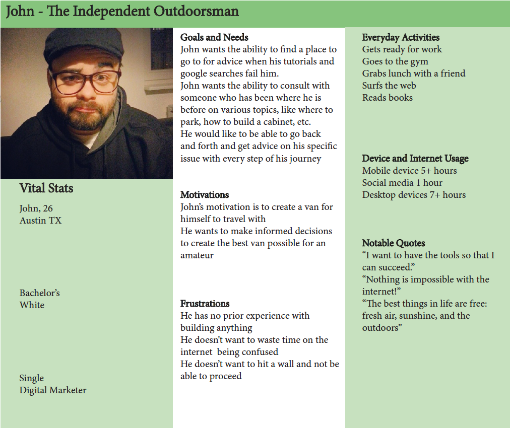
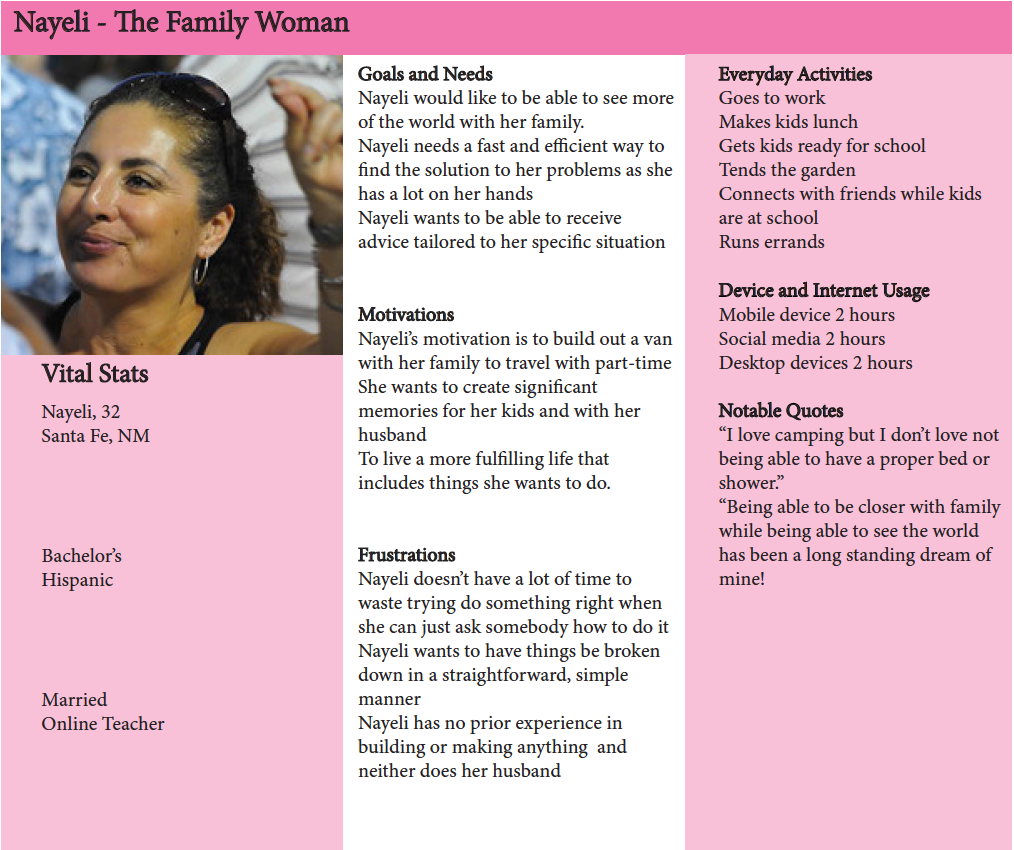
This led me to create two distinct user personas, John and Nayeli:
Problem Statements
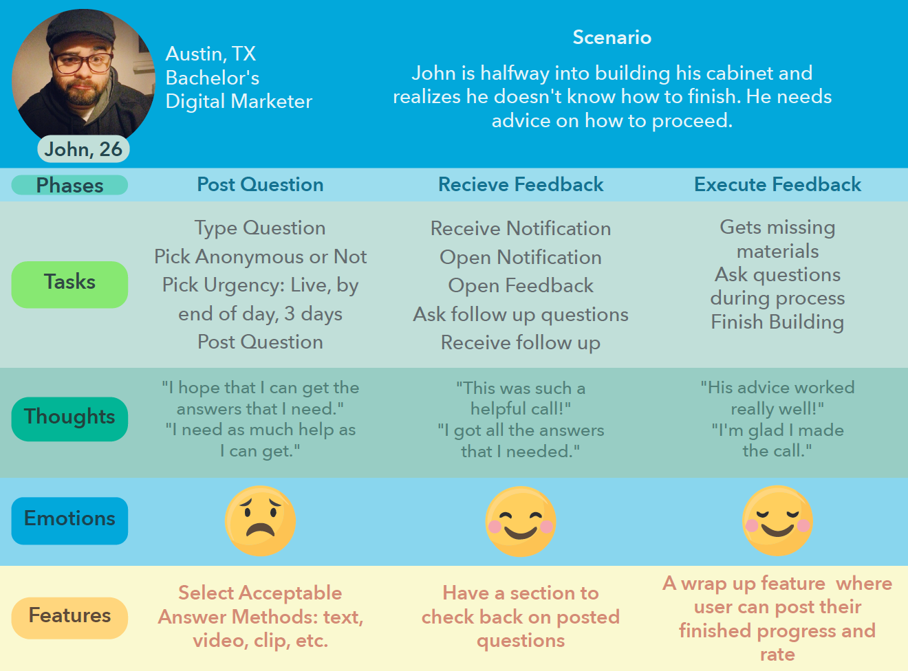
John wants the ability to find a place to go to for advice when his tutorials and google searches fail him.
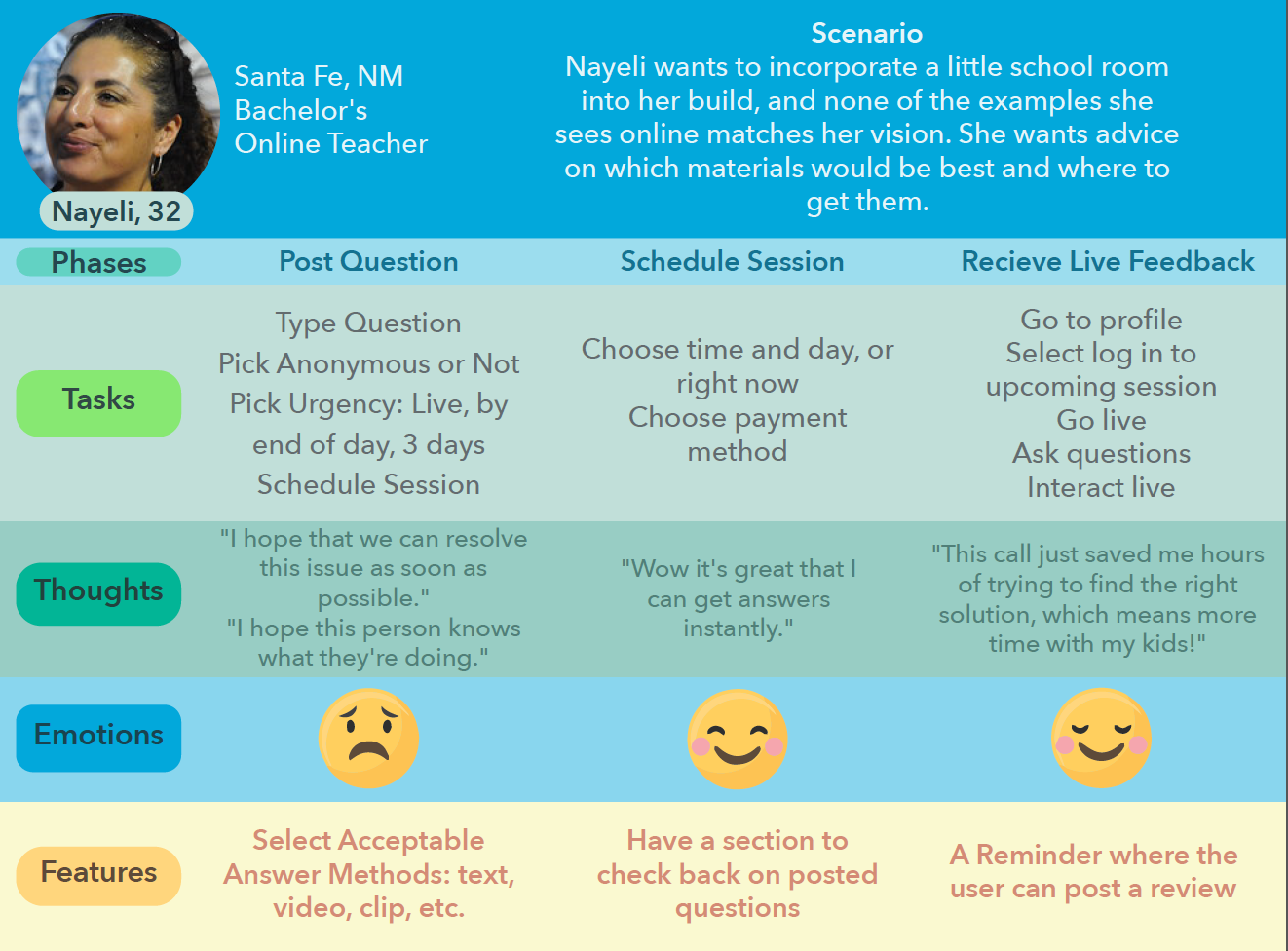
Nayeli needs a fast and efficient way to find the solution to her problems as she has a lot on her hands.
User Journeys
The next step in the process was creating user journeys to better understand what John and Nayeli would be facing in achieving their goals.
They helped define the thought processes and emotions that would occur.
Ideate
Finding Solutions
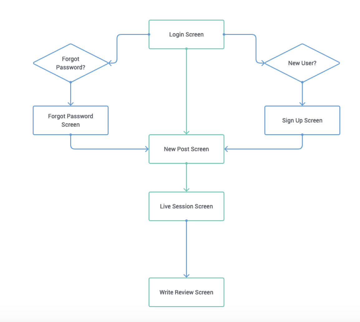
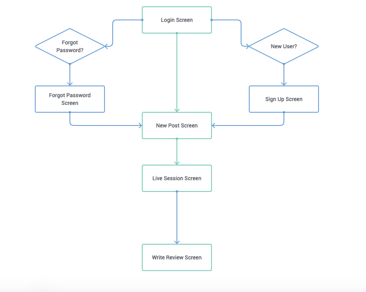
Before I could start wireframing and prototyping, I needed a blueprint. The blueprint came in the form of user flows. User flows became an incredibly useful tool for me because they define exactly what users like John and Nayeli would need from each screen to execute their goals.
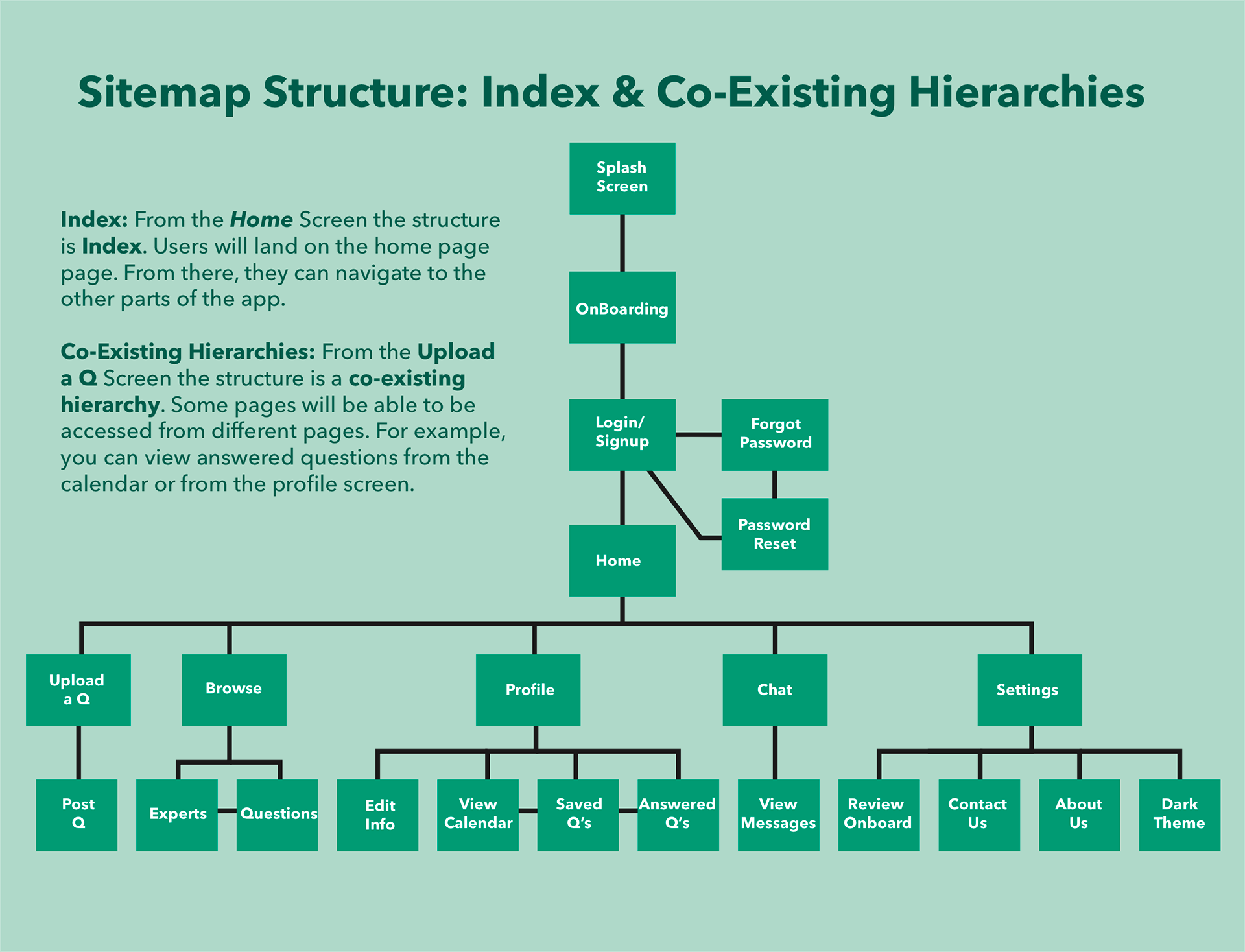
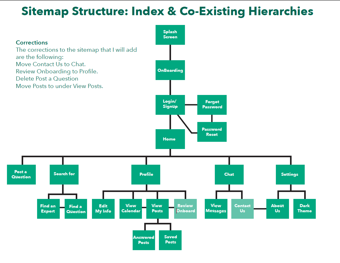
Before the site map could be finalized, I wanted to make sure that it would make sense to most users. I went to Optimal Sort to consult the wisdom of card sorts.
A couple of patterns emerged that caused me to switch up my site map:
• Users preferred Review Onboarding to be in the Profile as well as View Messages.
• The Settings category was all over the place.
• Perhaps Settings and Profile could be combined.
• The Settings category was all over the place.
• Perhaps Settings and Profile could be combined.
Before and After
Prototype
Finalizing Solutions
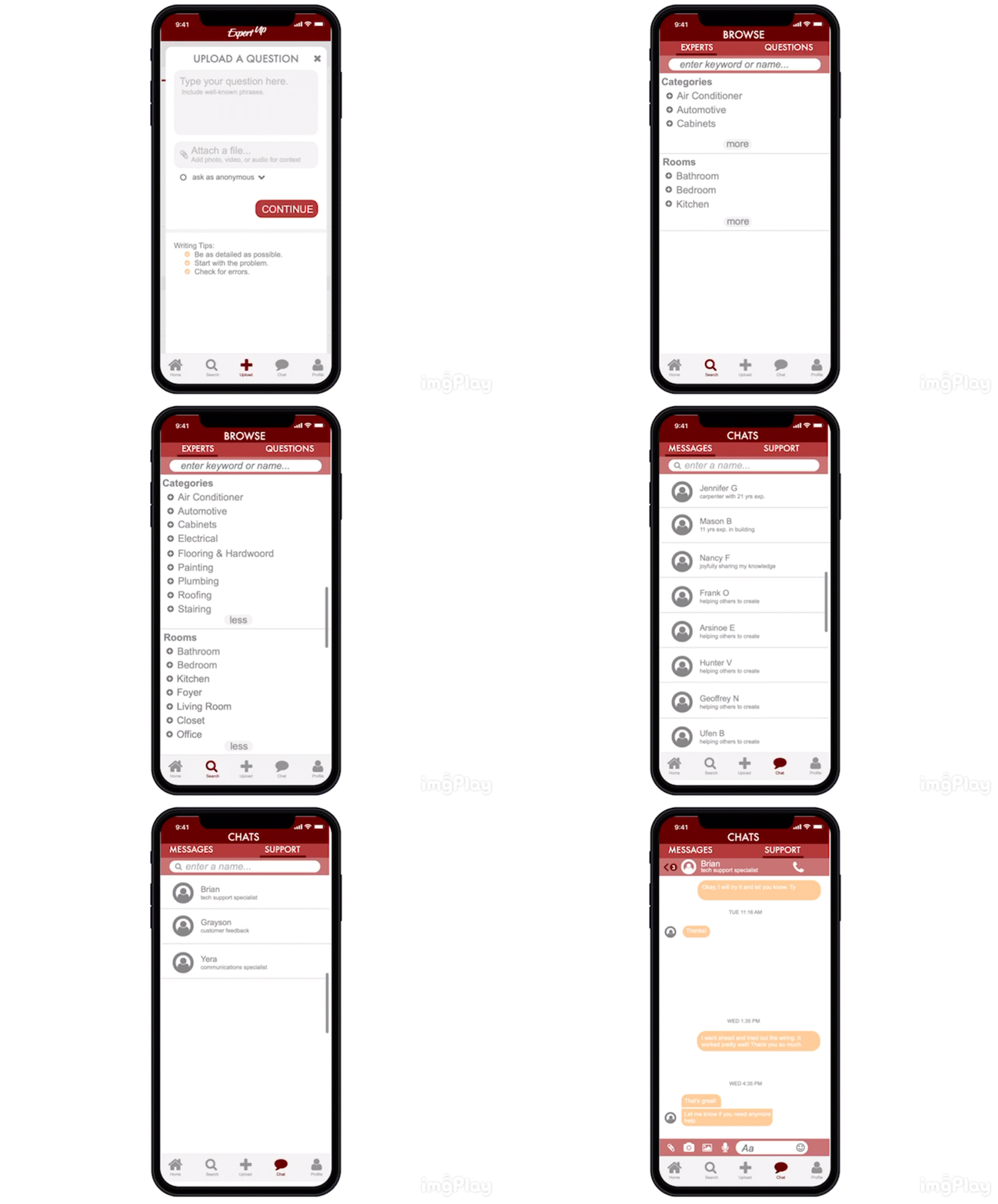
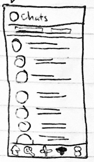
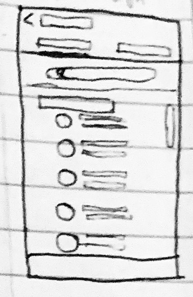
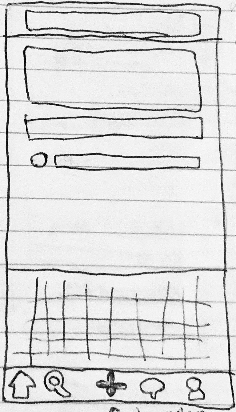
Now the time has come to create prototypes. With all the insights that I have gleaned from rounds of card sorts, interviews, user journeys and user flows, I started to sketch out the screens outlined in the site map screen by screen. Sketches and wireframes had to happen before the prototype. View Prototype.
Sketches
Using the user flows, I made sure that the main features of ExpertUp could be executed.
The Three Features:
Chat, Browse, and Upload
Test
Evaluating the Results
After creating the low fidelity wireframes, it was time to test it on real people and see how they performed. The goal here is to see if users would be able to navigate through the app. They would be asked to perform a user task. Then I would identify pain points where they couldn't and rectify them.
I started off with a usability test, gathering two in-person participants and 12 remote.
With the help of UsabilityHub, I was able to gather several forms of data about how the users were interacting with the prototype.
One form was heatmaps which showed me where they were clicking.
Another was percentages of how many completed the step. That showed me what screens most users were having trouble.
For example below:
Heatmap. Several testers pressed “read more”
See percentages at the top
I conducted two user tests:
1) Preference Test
2) Navigation Test of Post Question Task Flow
For the navigation test, users were given a scenario and then asked to complete it with the prototype.
Scenario:
WARNING!!! This test only allows you to TAP ONCE. Take time to choose your option carefully because it will end if your option doesn't have a next step. SCENARIO You have just started building a cabinet and have run into some trouble. You want advice from an expert who will give you an answer immeadiately. Start to ask your question.
To create the test, I took the screen flows I had designed and uploaded them as steps, creating hit zones where the user would press to move onto the next screen.
Step Two was a crucial point where users had to locate the Post Question button. 58% of them did.
The heatmap gave me more insight on the other 42%. It shows some users also pressed the Read More area, which they could have done out of curiosity. One of the quotes (see affinity map below under Observations) from the feedback stated something similar to this.
Takeaway: Although a very helpful resource, usabilityhub has a drawback where if the tester clicks the wrong place (The place you did not highlight) they are booted off the test and the test is over. This does not reflect how it works in real life because when using an app for the first few times users are free to explore and see where things lead.
For the number of users who clicked the Read More area mentioned above, they weren’t able to complete the rest of the test.
In the future, I would like to be able to use another testing platform or simply screen record a user interacting with the prototype. However, with a screen recording, you would have to manually create a heatmap yourself.
Findings: The results were compiled into an affinity map to identify patterns. This time I grouped according to Observations, Positive and Negative Quotes, and Errors.
Findings: The test results revealed where users were getting confused or stuck, and I used that to improve the screen layouts.
I had actually designed two ways for users to post a question, and it showed that not one user decided to press the plus button. This would make me decide to add text in addition to the icons at the bottom of the nav bar. I hoped it would make it easier for them to notice and understand its purpose.
The nav bar went from this…
…to this. I added text for even more clarification.
I continued to use feedback from users to refine each iteration of my screens.
Then, some best design practices such as the Laws of Gestalt and Principles of Design were implemented to also further improve the screens.
For example, the Home Screen evolved:Upload also evolved.
After getting user feedback about the white space, I added writing tips and moved the continue button down further.
Style Guide
In order to maintain a level of consistency throughout the design, a style guide was introduced. This would outline the color scheme, the fonts, button styles, and so on. If you noticed in the Home screen's revision, the logo was all over the place! A style guide was much needed.
Afterwards, my screens looked like this:
That's it! Overall, I learned a lot about the Design Thinking process and tinkering with many aspects of it helped get my prototype to where it is today.
