Prana
Role: Designer and Developer
Duration: 4 months
Software: Adobe Dreamweaver, Photoshop, Illustrator
Purpose
The original site’s cluttered appearance left me with cognitive overload, so I envisioned creating an intuitive and welcoming user experience. I wanted to transform the website to better represent a restaurant with a promising mission and good food.
Design Thinking
I used the design thinking process to go from idea to app for Prana. The steps served as a loose guide to ensure good user-centric design.
Visual Identity
The restaurant’s cuisine has a lot of colorful vegetables and earthy grains, so I incorporated this into the new visual identity.
Color Palette
An earthy and healthy color scheme that reflected the ethos of the restaurant seemed ideal. I went with warm, toasty browns and vibrant greens.
Sketches
Although the original site has over 8 pages, I decided to condense the website into 4 pages so it would be easier for the user to navigate: Home, Menu, About, Contact. I then went to task mapping out the pages on paper.
Mockups
Placing my final sketches into Illustrator, I transformed them into vector format. The icons were also custom made on Illustrator. I cropped and placed the photos on Photoshop.
Development
After creating mockups, I was ready to code the website into existence. I quantified the dimensions of each content block from the mockups, since exact numbers would be needed to code the site.
Unexpected Challenges
With Dreamweaver, I knew I wanted the home banner to be transparent, but didn’t know how to do it. Now matter what I tried, the site preview never changed. It took some counsel to learn how to change the transparency value.
The hosting platform didn’t have the font I initially wanted for the banner, so I had to choose a back up font, which was bulkier than what I would have liked.
Usability Testing
I created a preference test to see if the new design had impacted the end user. I put the old home page and new home page side by side without detailing which was which. Much to my delighted surprise, every single tester preferred the new design.
Research Results
Many people called it cleaner. Others said it was more inviting and easier to digest. One pointed out what I had noticed, that it looked like the creator had just used a Wordpress template to make the site.
Conclusion
I’m really satisfied with how the site came out. I was able to create a cohesive user experience that allows the user to discover the site without feeling overwhelmed. Having the changes confirmed in a statistically significant test makes me even more confident that I reached my goal of a website that effectively reflects the mission of a good restaurant and provides a smooth user experience.
Before and After
Home Page
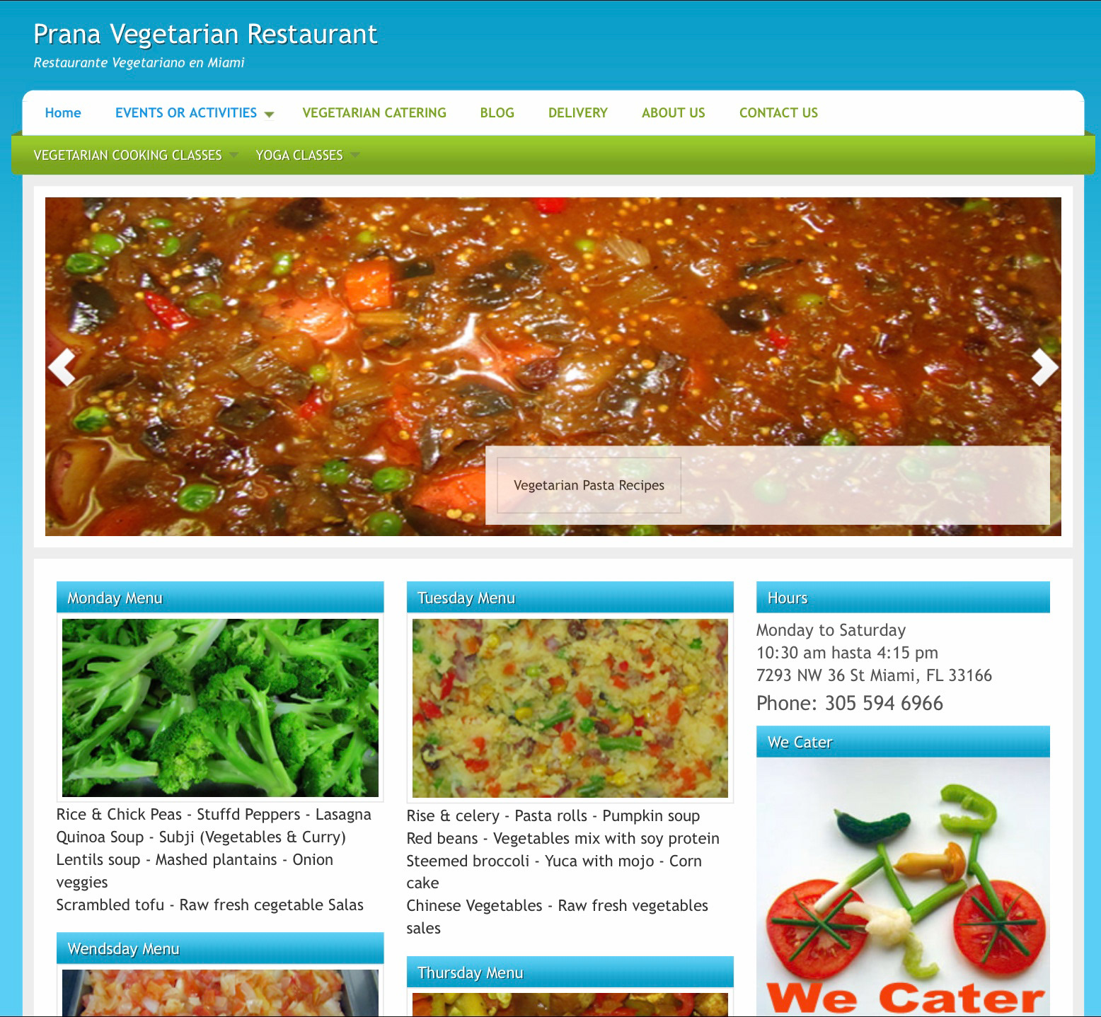
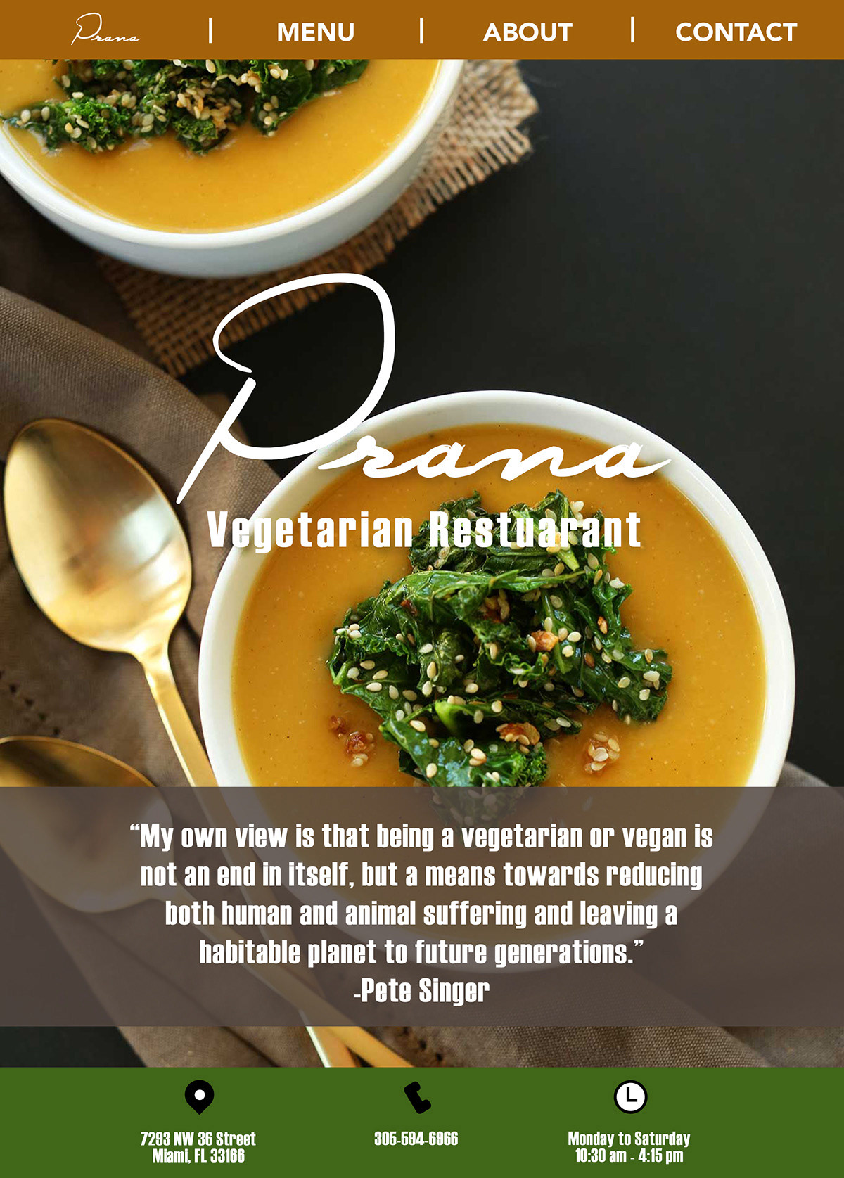
Before and After
Menu Page
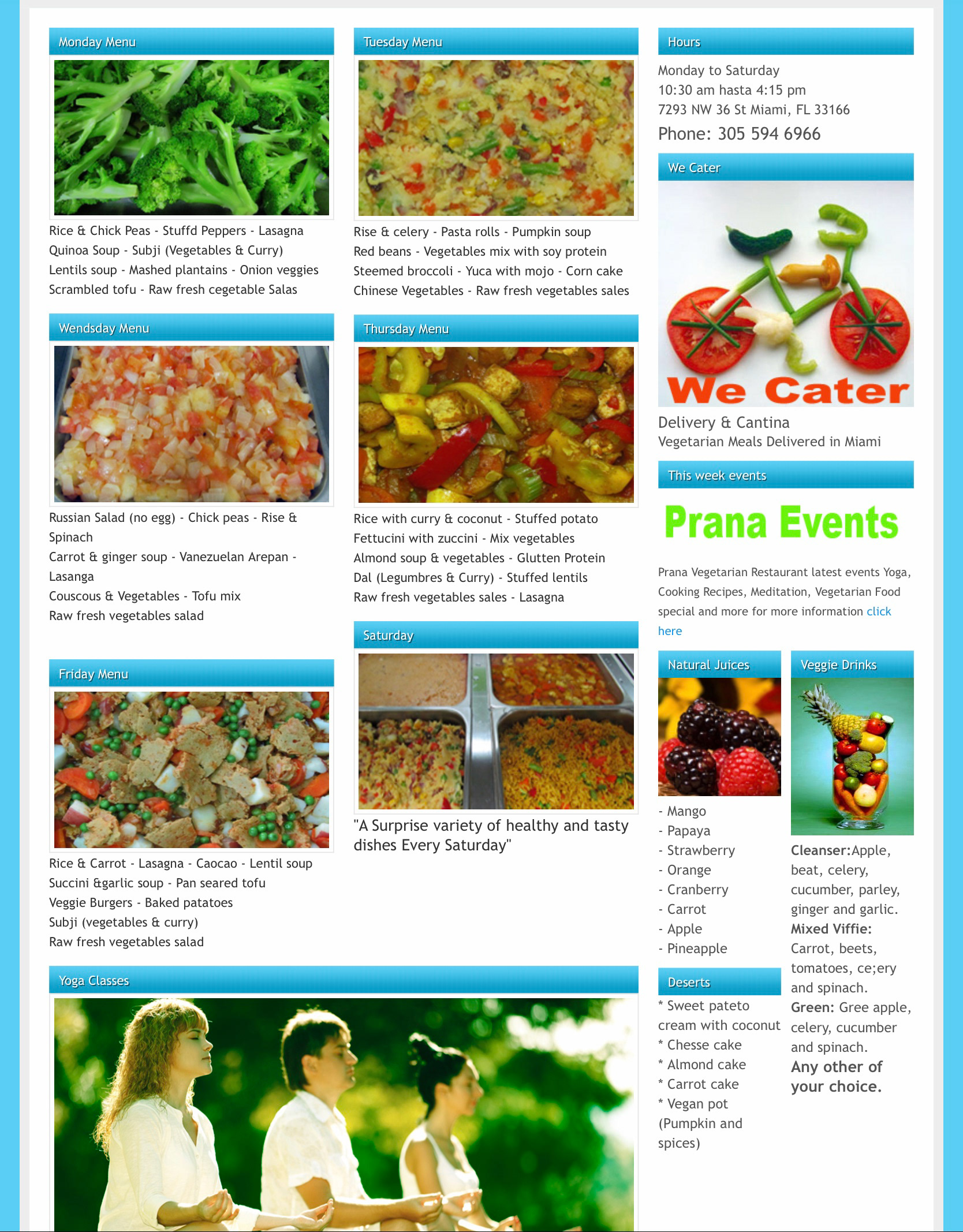
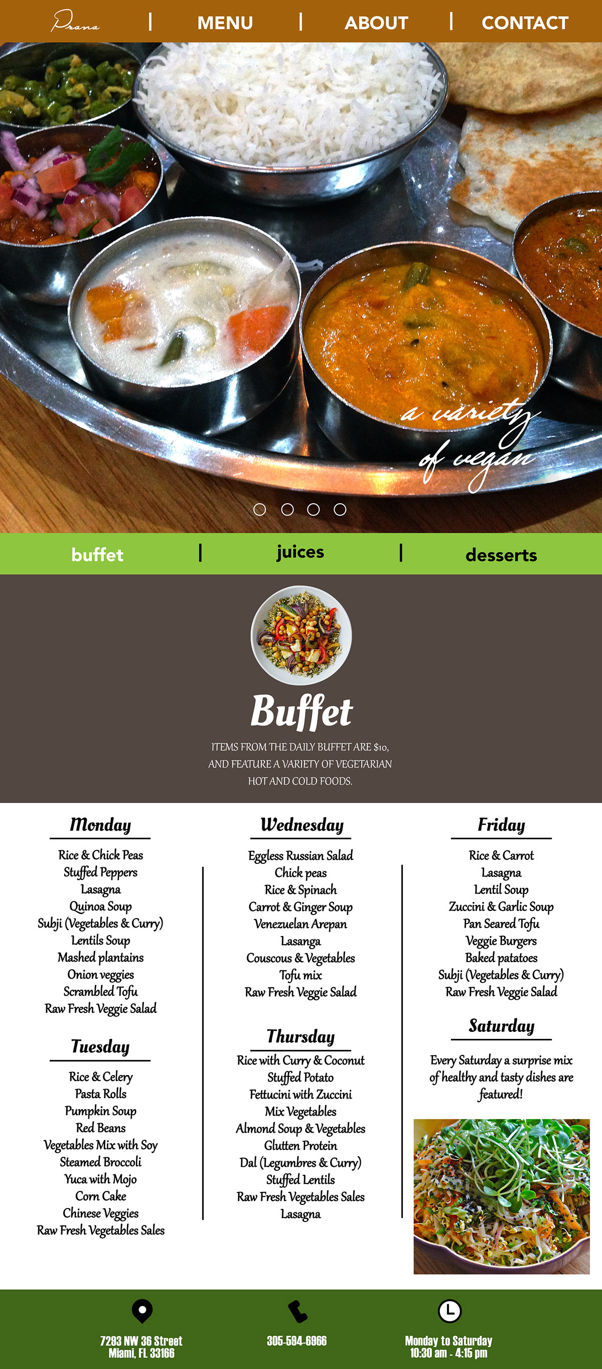
The menu is concentrated on the home page of the original site and divided by days. I included this distinction into the new design, deciding upon a simple grid format to display the menu content.
Before and After
About Page
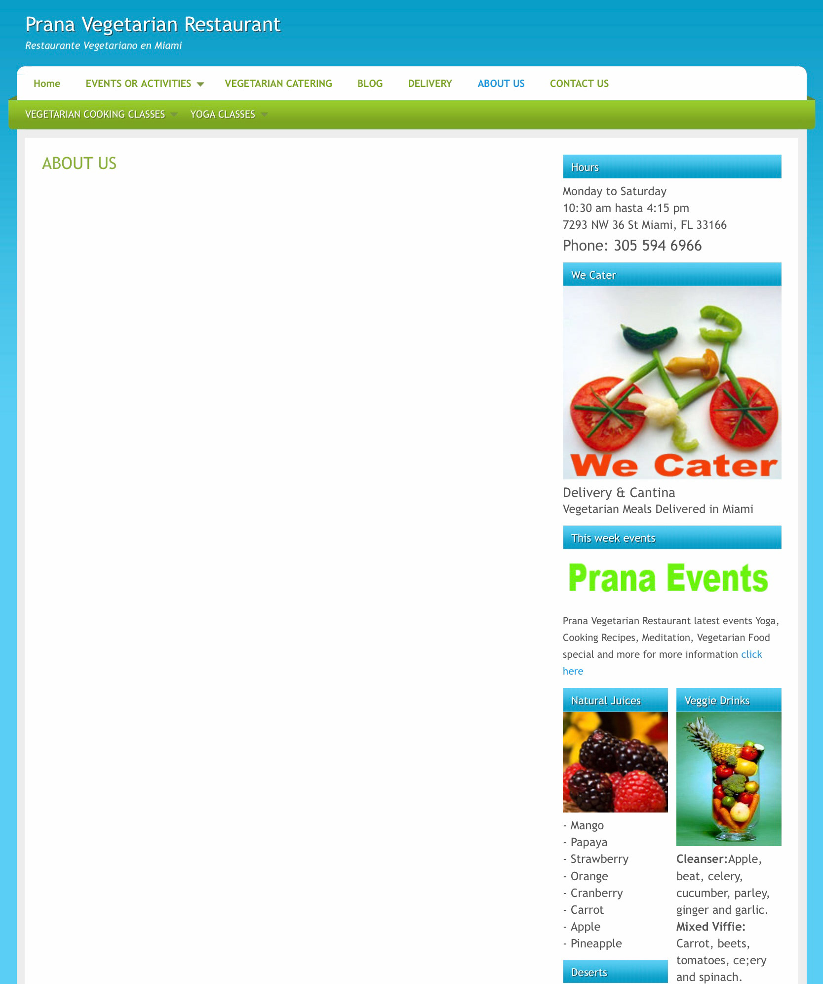
This is where the idea that it was from an empty Wordpress template or such became more clear. The about page had no main content.

Before and After
Contact Page
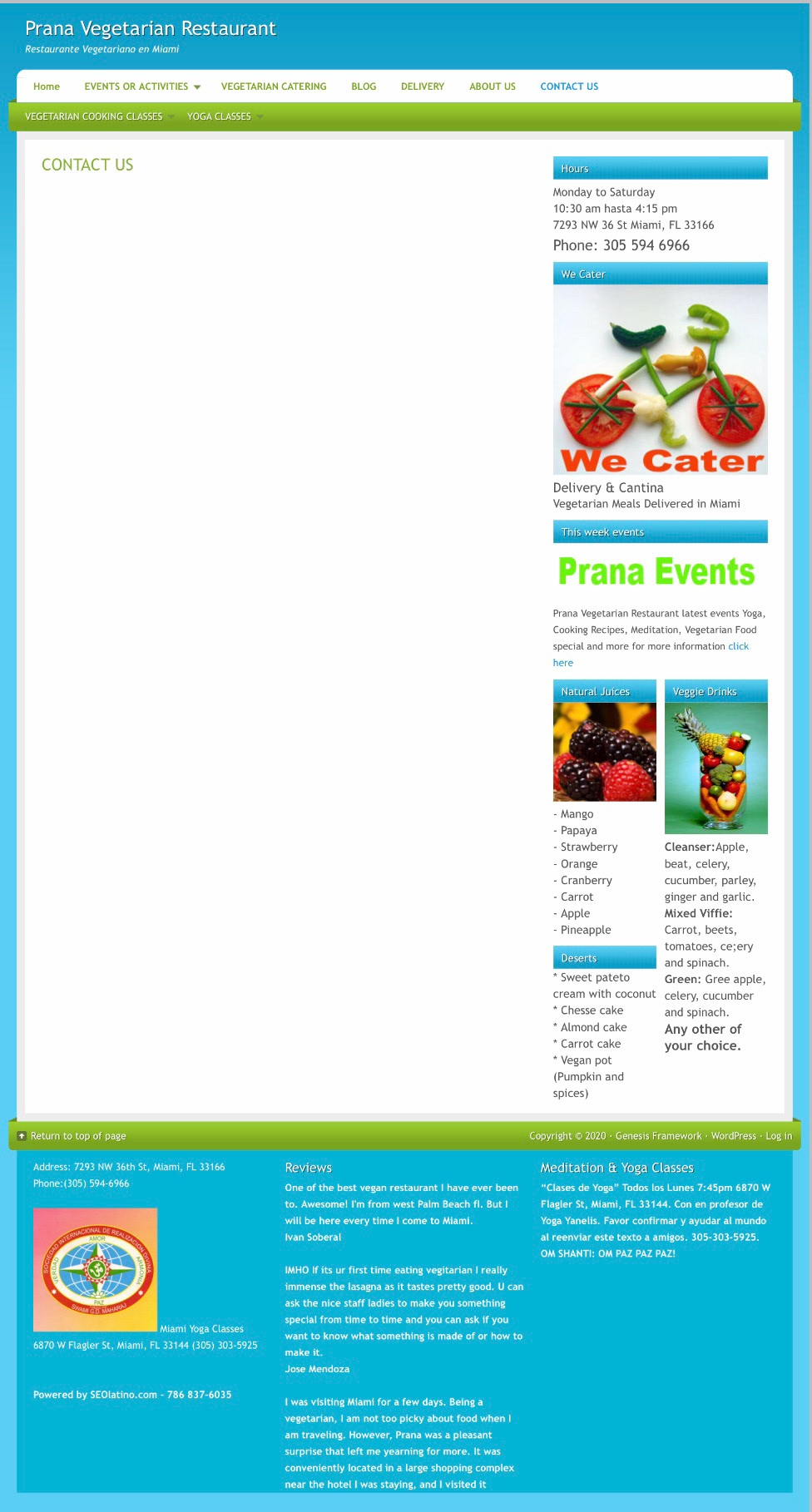
The Contact page was also blank. Instead, all of the contact information was crammed into the footer of the site, in addition to reviews and random information about yoga classes.
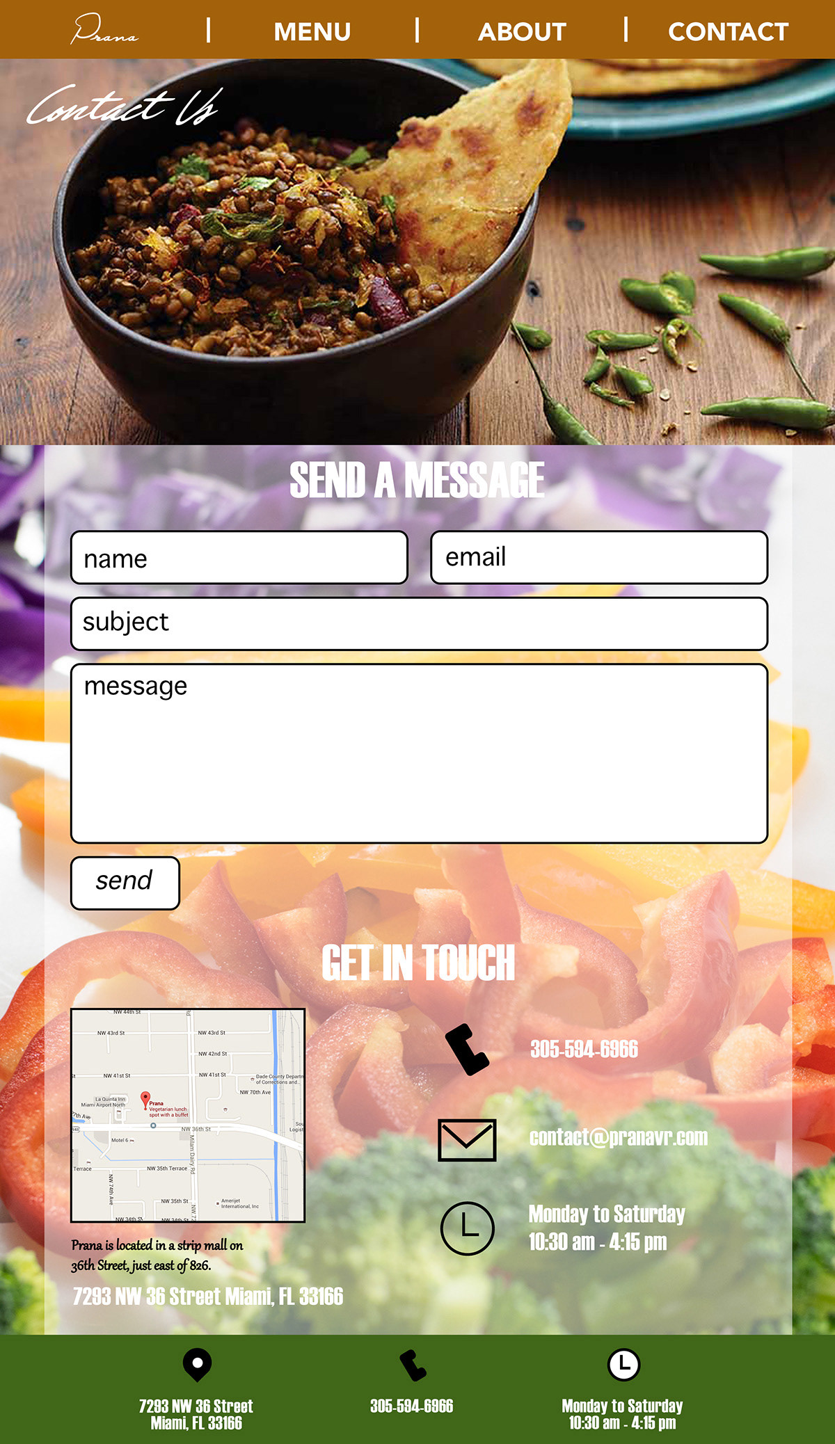
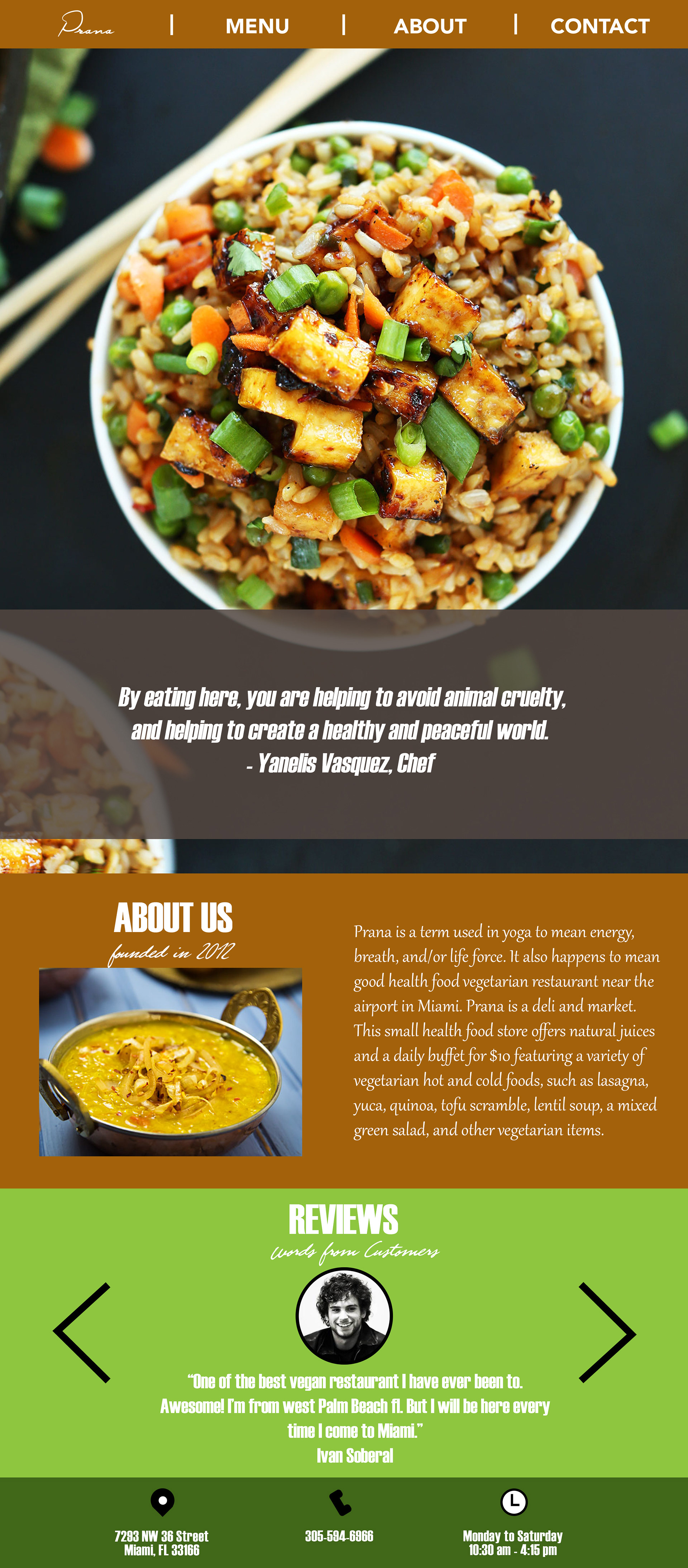
All New Pages
The new look has a cohesiveness and the content is spread out evenly across all pages. I was pleased with the overall effect.



Thank you for viewing all the way to the end!
Hope you're not hungry now. 😄 🍛
